I love photographing wildlife, but sometimes I take time out to shoot captive animals, usually to get shots of particular species for image agencies. Looking through my image database, roughly 20% of my portfolio is made up of captive animals.
Working with captive animals makes it possible to get shots that would be almost impossible with wildlife. This gives you an opportunity to get creative and show the creature in a different way. On a recent shoot of captive birds of prey in the Czech republic, I got the opportunity to photograph a Little Owl. The falconers obligingly placed the owl in a natural hollow in a tree which made a nice shot - see below. It's nice and natural looking, with a distant background that's blurred to avoid distractions and lots of texture and detail in the feathers and tree bark made possible by close up, low ISO shooting (something that's pretty rare with the owl's wild cousins). So, overall a pleasing image, but to be honest, not much different from most other captive little owl shots. Time to get a bit more creative...
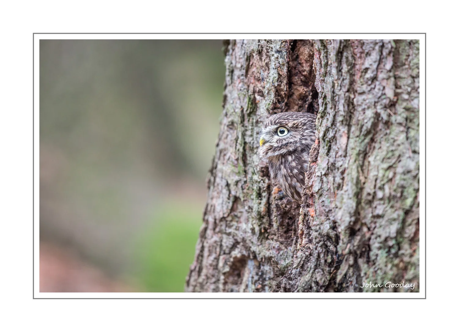
(Image: Pleasant, but pretty ordinary viewpoint. Canon EOS 1DX, EF500mm f/4L IS II, 1/200th sec @ f/4, ISO 800, tripod)
I wanted to get something that exploited the approachability of the tame owl but still showed it in the context of it's surrounds. Obviously, getting much closer would give a more dramatic view but how to include some of the environment, and give the shot a different feel to the telephoto images I normally get of wild owls? You'd hardly ever use a very wide angle lens to photograph wild owls - you normally can't get close enough to them - so using one here would be the opposite of a conventional shot. I duly attached a 24mm lens and got close to the owl - about 30cm away. This gave me a view of the owl staring into the lens with the tree trunk some of the forest in the background. Not bad, but could we go further?
Normally, I try to shoot animals at their eye level. Shooting down detaches the viewer from the animal, eye-level puts them into its world. So eye level is 'normal' shooting, and above is not that good... what about below? I got the camera to the base of the tree and pointed upwards at the owl. This gave a much more dramatic viewpoint. The wide angle lens exaggerated perspective making the tree trunk seem taller which gave a sense of the little owl being a small creature. It also gave a view of the forest from a different angle. Below is my first attempt. While I liked the unusual perspective, the white sky and shadowy base of the tree meant that the shot didn't really work.

(Image: nice idea, shame about the lighting! Canon EOS 1DX, EF24-105 f/4L @ 28mm, 1/40 sec @ f/8, ISO 1000)
A couple of days later the weather was sunny and I had the opportunity to try the shot again. This time I exposed the image for the sky in order to get a nice blue. This meant that the foreground and owl were very underexposed. From my previous attempt, I was ready for this and had a solution: flash. I used a radio triggered Canon EX600-RT speedlight fitted with a a small softbox (in this case, the very portable but strangely named Rogue Flash Bender and diffusion screen). The radio triggering meant that I could get the flash off camera and avoid the rabbit-in-the-headlights look common in hotshoe-mounted flash images. I was fortunate in having a Voice Activated Light Stand with me to hold the flash in the right place (in this case, the ever obliging Filip Fabian of Tatra Photography www.tatraphotographyworkshop.com). The centre of the soft box was positioned at owl eye level about 30 degrees right of camera, tilted slightly upwards. By having the light source a little off centre, I kept a little shadow on the right hand edge of the hollow which gave the impression of depth. The soft box produced a much less harsh light than bare flash, and created a nicer catchlight in the owl's eyes. I used the flash in TTL mode, but with flash exposure compensation at -1 stop as I didn't want the owl too bright compared to the sky. I also used a wider aperture than previously as I didn't think stopping down to f/8 had made for a good image in my previous attempt. Here's the resulting image:
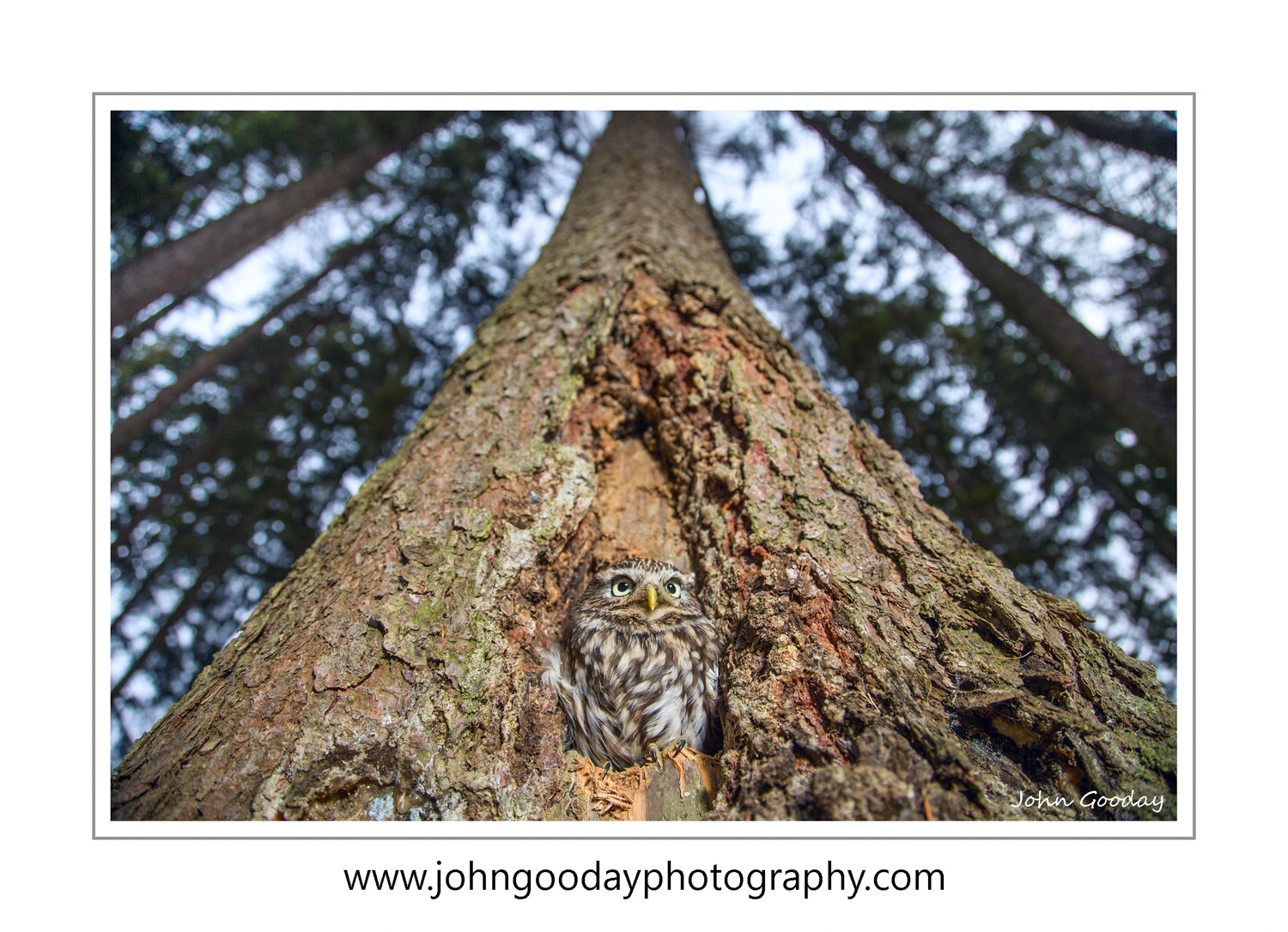
(Image: Canon EOS 1DX, EF24-105 f/4L IS @ 24mm, 1/250 sec @ f/4, ISO 100, EX600-RT speedlight with small softbox)
There were a few things that might have improved the image further. I would have liked to have used an even wider lens to further enhance the perspective effect, but sadly I didn't have room to pack one. A polarizing filter would also have given me more control over the sky colour, but I'd managed to leave this behind. Even without these additions, I think the image is more eye catching than a straight-forward telephoto shot of the owl in the tree hollow.