
When I need to correct colours in an image using Photoshop, I generally work in the LAB colour space. A lot of people seem to avoid LAB and stick to either AdobeRGB or sRGB, but LAB has a number of advantages and can help you do some things a lot faster than the more usual colour spaces. Here, I look a little bit at what Lab is (the theory…) and show how it can be used to target and change specific colours in an image. I’m probably shooting myself in the foot when I say this but… you can skip to the practical example without reading the theory bit – you don’t need to understand the theory to use Lab, I just think it’s nice to know why things happen the way they do.
One important thing: you’ll need to view the images below on a properly calibrated monitor to see the adjustments correctly.
The theory bit: What is Lab?
Well, let’s start with what a colour space is. A colour space is model that your camera, Photoshop, and various other applications and devices use to work out what colour, and how bright or dark, things are. You’re probably familiar with the RGB method of representing colour – here, every point (think pixel, in practical, if slightly inaccurate, terms) has a separate Red, Green and Blue value. These three values together define a unique colour and that’s how your camera records each pixel’s colour – it saves a Red, Green and Blue value. The values usually go from 0 to 255 for each colour. If Red, Green and Blue are all 0, then that represents black. If they’re all 255, that’s white. If Red is 255 and the other colours are 0, then that’s a really bright, vibrant Red… and so on for various combinations of the colours.
An RGB colour space is just a three dimensional graph with three axis (Red, Green, Blue… surprise, surprise) that maps RGB input values to colours. In order that everything (camera, monitor etc.) are speaking the same language and know what colour a particular RGB value should correspond to, they use a standard, documented colour space. (Actually, there is a bit more to it than that – to ensure that the blue of a blueberry as seen by the camera matches the blue of the blueberry when the photograph taken is displayed on a monitor we also need something that takes into account each device’s characteristics and their effect on the way it records/displays colour – this is called a device dependent colour profile, in case you’re interested… but we’ll ignore this complication for now to make things simpler).The two most common RGB standards are the sRGB and AdobeRGB color spaces. AdobeRGB is structured to represent a wider range of colours than sRGB – we say that AdobeRGB has a wider gamut, to use the appropriate technical term - although it isn’t possible to display all of the colours in AdobeRGB on a standard monitor or print, so you probably won’t see a noticeable difference unless you have a high-end graphics monitor designed for AdobeRGB.
So, having defined what a colour space is, it’s time to look at what’s special about Lab. Like RGB, Lab colour space has three different values but they represent rather different things. The first value, L, represents lightness – how bright or dark a point is. (In RGB each of the colour values represents a colour at a particular brightness R=100, G=0,B=0 is a brighter and more vivid red than R=10, G=0, B=0. In RGB, there’s no separate lightness channel).
The other two Lab values - ‘a’ and ‘b’ - represent colour. Both must have values between -128 and +127. In a, -128 represent pure Green, 127 represents pure Red. The values in between are how green or red a particular colour is, with 0 being neutral. The ‘b’ value works in the same way, but has Blue at -128 and Yellow at 127. (Remember that complication of device profiles we mentioned when talking about RGB? Well, lab doesn’t suffer from this – it’s device independent. In fact, it’s so independent that it gets used a lot under the hood of programs such as Photoshop, especially when you are converting an image from one colour space to another).
Lab has some nice properties from an image editing point-of-view that RGB colour spaces just don’t have. Remember how RGB wraps brightness information into the Red, Green and Blue values? Well, that means that when you change how bright or dull something is with an image editing program working in RGB you also change its colour as well (have you ever noticed that colour fades and shifts a little as you turn up the brightness…?). That’s not a nice side effect. In Lab, you can change how bright things are by changing the L value without causing any change to their colour.
Lab is a very wide gamut colour space - it can represent a very large range of colours, more than sRGB and AdobeRGB. This allows us to have many more shades of, say, purple than in the other spaces. That’s very handy when we are trying to make up for the limitations of our cameras – we can stretch out a colour in Lab to give the impression of subtle variations in shades.
Lab’s wide gamut also makes it easier to select a specific colour or colour range using, say, curves in Photoshop than if we were working in RGB (which is the aspect we’ll look at in the practical section below).
Lab was designed to represent colour in as close a way to the human visual system as possible. Shifting colour shades in the a and b channels gives very natural looking changes rather than the sometimes weird effects you get from moving the Red, Green and Blue sliders in RGB space.
If a=0 and b=0 in Lab, then you have a neutral grey – the brightness of the grey is controlled by the Lab value. This makes it much easier to target neutrals in an image and monitor them for changes (very handy if you’re a people photographer and want to keep skin tone carefully controlled while you’re editing colour).
The practical bit: fixing unrealistic colours (or ‘Do you have something for my bird – he’s a bit off-colour’)
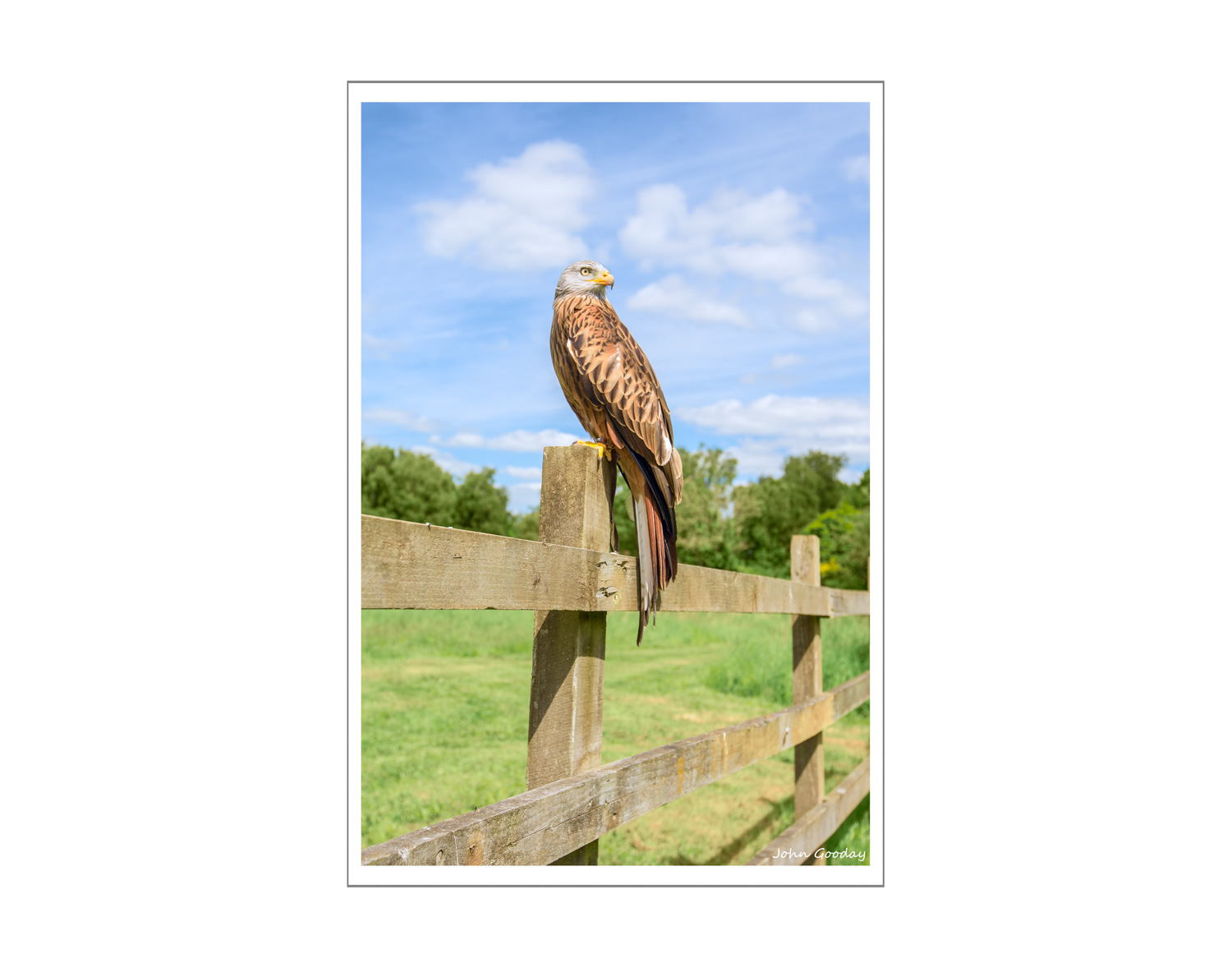
Let’s start with the problem. This image of a Red Kite on a fence post is suffering from a washed out and generally insipid sky. The sky looked nice and blue on the day that I took the shot, but in bright sunlight my camera couldn’t reproduce the strong blues and also cope with getting the shadow details as accurately as I’d have liked. I had to settle for either a darker, bluer sky with not much shadow detail elsewhere, or shadow detail and a washed out sky (note that I said washed out rather than burnt out - Lab won't magically fix loss of detail in overexposed areas). The grass also looks a slightly unrealistic colour, sort of yelowish green – as humans we’re especially sensitive to slight nuances of green, so this is more noticeable than I’d like. The bird itself is fine. So, how can we quickly fix the sky (a problem with blues) and the grass (a problem with greens and yellows) without changing the appearance of the bird?

You could carefully select the sky in Photoshop, using magic wand, lasso or another tool and push up the blue saturation in the sky. Then you could select the grass and work on that, maybe using Color Balance / Hue Saturation / fiddling about with the RGB channels. This would no doubt make the photo look better, but all that selecting and adjusting does take time, patience and a degree of skill if it’s to look natural.
So, here’s an alternative using Lab and one curves adjustment layer…
Once you’ve got your image into Photoshop, the first step is to convert it into Lab colour. You can do this either from Image -> Mode -> Lab or Edit->Convert to profile then select Lab Color as the target space.
Next, create a curves adjustment layer (Layers->New Adjustment Layer->Curves). When you open the curves you’ll see the L channel of Lab displayed, something like this:

First things first... if you look at the icons running down the left hand side of the dialogue box above, you’ll notice an exclamation mark on the bottom one. This is telling you that Photoshop has only created an approximate (rather than accurate) graph to save time. I’d advise you to remedy this by clicking on the icon – that tells Photoshop to go back and try harder. More importantly, you’ll now get an accurate graph to work with. As you can see from the drop down box second from the top, we’re currently looking at Lightness – that’s how bright or dark things are and won’t help us fix colour problems. To fix colour we need to change to the a or b channels, so select one of these from the drop down menu.
Here’s the b channel graph (ignore the red labels that I’ve added for a moment...)

The lefthand icon that looks like a pointing hand with two arrows is key to finding out what we need to change. Click this and then slowly move the mouse around the photo itself – you’ll see a dot moving on the graph to show you the b value for whatever point on the picture your mouse is over. You’ll soon notice that the grass colour values are all in the region I’ve labelled G and the sky colour values are all in the region I’ve labelled S. So these are the parts of the curve we need to adjust if we want to change grass and sky respectively.
Start by clicking along the diagonal line to add some anchor points either side of the S and G regions – the purpose of these is to keep the rest of the curve in place when we start adjusting G and S. Now click in the middle of S and drag down or up and observe the change – dragging down immediately intensifies the blues in the sky – just what we wanted! You might need to add a few more anchor points to keep the rest of the line in place, as I’ve done here. Try the same in with a point in the G area – this time, dragging the point down makes the grass less yellow. Note that the other colours in the picture don’t change – just the sky and grass. You can see my adjusted curve below. That was certainly a lot quicker than making lots of selections and adjustments.

(Those of you who have stayed awake up to this point might notice that I've also squished the bottom left and top right of the original diagonal line in towards the centre just a bit - this intensifies the colours a little more) You can now do the same kind of adjustment to the with the a channel. As it happens, in this particular picture the b curve is really all you need – you’ll get a feel for this once you’ve worked on a few images. In our Red Kite photo, all the colour we need to change lies in b which, if you remember, represents blue and yellow. If I wanted to make the grass a more vibrant green, rather than just less yellow, then I’d adjust also the a channel (the a channel holds all the data about reds and greens).
Here are the before and after images side-by-side for comparison .

The approach described here won’t work on every image, but it does work on the majority. Hopefully, it illustrates one advantage of working in Lab colour space.